Interior design is both an art and a science that requires a deep understanding of fundamental principles to create stunning spaces. Among these principles, contrast in interior design stands out as one of the most powerful tools in a designer’s arsenal. At P29 Interior Design, we’ve mastered the art of using contrast to transform ordinary spaces into extraordinary environments that captivate and inspire.
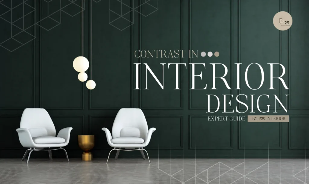
Table of Contents
What is Contrast in Interior Design: Understanding the Fundamentals
What is contrast in interior design? At its core, contrast occurs when two or more elements with opposing characteristics are deliberately placed together in a space. This strategic placement creates visual interest, adds depth, and brings dynamic energy to any room. As experienced professionals in interior design, we at P29 Interior Design understand that contrast is not just about creating differences – it’s about creating meaningful interactions between elements that enhance the overall design narrative.
The Psychology Behind Contrast
Contrast plays a crucial role in how we perceive and experience spaces. Here’s why it matters:
- Visual Hierarchy: Contrast helps establish a clear visual hierarchy, guiding the eye through the space naturally
- Emotional Impact: Different contrasting elements can evoke specific emotional responses
- Spatial Perception: Strategic use of contrast can alter how we perceive room dimensions
- Memory Formation: Spaces with well-executed contrast are more memorable and impactful
- Cognitive Processing: Our brains are naturally drawn to contrasting elements
- Comfort Levels: Proper contrast can create a sense of balance and comfort
- Aesthetic Appeal: Contrast adds sophistication and visual interest
- Functional Definition: It helps define different areas and their purposes
Essential Elements of Contrast in Interior Design
1. Color Contrast
Color is perhaps the most powerful tool for creating contrast. Here’s how to master it:
- Complementary Colors: Pairing colors from opposite sides of the color wheel (blue/orange, purple/yellow)
- Monochromatic Contrast: Using varying shades and tints of the same color
- Temperature Contrast: Combining warm and cool tones strategically
- Value Contrast: Mixing light and dark shades effectively
- Saturation Contrast: Pairing vivid colors with muted tones
- Neutral Contrast: Using black and white with accent colors
- Pattern Contrast: Incorporating contrasting color patterns
- Seasonal Color Contrast: Mixing colors that represent different seasons
2. Textural Contrast
Texture adds depth and tactile interest to spaces. Consider these contrasting combinations:
- Smooth vs. Rough: Polished marble against rustic wood
- Soft vs. Hard: Plush fabrics against metal surfaces
- Matte vs. Glossy: Flat-finish walls with glossy accessories
- Natural vs. Manufactured: Organic materials against synthetic ones
- Woven vs. Solid: Textured fabrics against smooth surfaces
- Transparent vs. Opaque: Glass elements with solid materials
- Patterned vs. Plain: Textured wallpapers with smooth furnishings
- Layered vs. Single: Multiple textures against uniform surfaces
3. Form and Shape Contrast
The interplay of different forms creates dynamic visual interest:
- Angular vs. Curved: Combining sharp edges with flowing lines
- Geometric vs. Organic: Structured shapes with natural forms
- Large vs. Small: Mixing different scale elements
- Horizontal vs. Vertical: Playing with directional contrasts
- Simple vs. Complex: Basic forms against intricate designs
- Symmetrical vs. Asymmetrical: Balanced against unbalanced elements
- Regular vs. Irregular: Consistent patterns with random elements
- Solid vs. Void: Full forms against negative space
Advanced Techniques for Creating Contrast
Material Selection and Combination
Professional designers recommend these material contrasts:
- Metal and Wood: Industrial elements with natural warmth
- Glass and Stone: Transparency against solidity
- Leather and Fabric: Smooth against textured surfaces
- Concrete and Textiles: Raw industrial with soft furnishings
- Ceramic and Wood: Glazed surfaces with natural grains
- Acrylic and Metal: Modern synthetics with traditional materials
- Natural and Synthetic: Organic materials with manufactured ones
- Woven and Solid: Basketry against smooth surfaces
Scale and Proportion
Creating contrast through size relationships:
- Furniture Scaling: Mix oversized pieces with delicate accents
- Architectural Elements: Combine high ceilings with low furniture
- Art Placement: Large artwork with small decorative pieces
- Lighting Fixtures: Dramatic large fixtures with subtle accent lights
- Room Divisions: Open spaces contrasting with intimate corners
- Decorative Elements: Bold statement pieces with minimal accessories
- Pattern Scaling: Large patterns with small detailed designs
- Plant Selection: Tall plants with low-growing varieties
Best Practices for Implementing Contrast
Finding the Right Balance
At P29 Interior Design, we follow these guidelines:
- Start with a dominant element
- Add contrasting elements gradually
- Maintain visual harmony
- Consider the room’s purpose
- Account for natural light
- Factor in room size
- Include transitional elements
- Evaluate the overall impact
Common Mistakes to Avoid
- Over-contrasting elements
- Ignoring the room’s function
- Inconsistent application
- Poor balance in distribution
- Neglecting transition spaces
- Forced contrasts
- Lack of unity
- Overwhelming combinations
Frequently Asked Questions About Contrast in Interior Design
How do I start incorporating contrast in my interior design?
Starting with contrast can seem overwhelming, but it doesn’t have to be. Begin with simple color contrasts in accessories before moving to larger elements. For inspiration, explore our extensive portfolio showcasing successful contrast implementations in various projects.
What are the most effective types of contrast in interior design?
The most effective types include color contrast, texture contrast, and form contrast. The key is choosing the right combination for your space. Learn more about our professional design services to find the perfect contrast elements for your needs.
Can contrast be too overwhelming in a room?
Yes, contrast can be overwhelming if not properly balanced. That’s why it’s crucial to work with experienced professionals who understand how to create harmonious contrast that enhances rather than dominates a space.
How do I create contrast in a small space?
In small spaces, focus on subtle contrasts through textures and tones rather than bold color opposites. Consider using vertical elements to create height contrast or mixing small patterns with larger ones.
What are the best color combinations for creating contrast?
While black and white is the classic contrast combination, there are many effective options like navy and cream, charcoal and blush, or forest green and gold. The key is choosing colors that complement your overall design scheme.
How can I use contrast to highlight architectural features?
Contrast can emphasize architectural features through color, lighting, or material differences. For example, using darker colors on trim against lighter walls, or highlighting ceiling moldings with metallic finishes against matte surfaces.
Conclusion
Understanding and mastering contrast in interior design is crucial for creating compelling spaces. At P29 Interior Design, we believe that successful contrast is about more than just opposing elements – it’s about creating harmonious interactions that enhance the overall design narrative. Whether through color, texture, form, or materials, contrast can transform any space from ordinary to extraordinary.